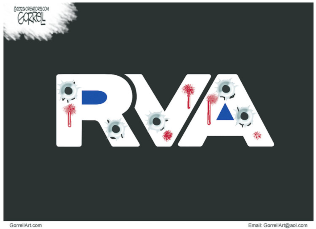
An Example of Extreme Kerning
Kerning is the typographic practice of adjusting the space between letters to the letters all look the same distance apart. This is something that old-fashioned typewriters weren’t very good at—they compressed the letter “m” and stretched out the letter “i” because the carriage moved the same distance for every letter. Modern proportional fonts manage the space that each letter takes up so the distance between proportional letters looks the same. Modern word processing software allows you to manually adjust the kerning, which is handy when you use display fonts in large sizes.
Here the kerning is so strong, the letters actually overlap and the shape of the “V” is adjusted to make the kerning look right. Kerning doesn’t normally change the shape of a letter, hence my use of the word “extreme.”
I looked up the acronym online, and discovered that it can stand for a lot of things! So I guess this post remains safely typographic and not political.


Leave a Reply