As you like
(My apologies to Shakespeare for the title of this post; at least it’s grammatical.) I had planned another serious lesson for today, but this comic popped up. It mentions a grammatical issue I’ve been wanting to mention for a long time, correct use of “like” and “as.”
It’s not hard, really. We use both words for comparisons. Remember that “like” is a preposition, so it goes with nouns and pronouns. The trick is that with “as,” which is an adverb, we often leave out the verb, and all you see is a nearby noun. Perhaps you remember the book Black Like Me. The grammar of the title is correct. If you wanted “as” in that phrase, you’d have to say “Black as I.” Where’s the verb? It’s implied. You’re really saying “Black as I am.”
So maybe this is part of The Hard Part of Writing—you have to think about what you’re writing. Are you comparing a noun or a verb? Test by seeing if you can insert a verb into your sentence.
All that to get to the comic:
Regular readers of this site might recall that I am a fan of Brooke McEldowney, who writes and draws two erudite comics. The one above is 9 Chickweed Lane, and the other is Pibgorn. I recommend them both.
Subscribe to this blog's RSS feed
Watch what you say
This material falls into the category I call The Hard Part of Writing. It’s not hard, but you have to think about what you’re writing, which is easy to be careless about. The principle here is to use common sense, not grammar.
Rule: Write what you actually mean to say.
One of the main things I do when I’m editing someone else’s writing is look for this kind of mistake. In fact, the best way to notice this error is to put some time between the writing and the proofreading.
Here’s an example of someone not writing what they really mean: It’s from a pretty good online drawing program called Cacoo. It’s not unlike Visio in operation, and you can’t beat the price; it’s free.
Currently we support 20 languages but we want to increase the languages we support in order to make it easier for people to use Cacoo.
Here’s the problem: they don’t want to increase the languages themselves, they want to increase the number of languages they support. Since that’s what they mean, that’s what they should write. (Yes, I noticed that they should have written “to make it easier…” instead of “in order to make it easier…” I hope you did, too.)
Another example, this one from an animated talk given under the sponsorship of the RSA (Royal Society for the encouragement of Arts, Manufactures and Commerce).
It’s a shame that poor children’s lives are ruined because of an operation that costs only $20.
I rather suspect that the meaning was a lack of the operation, not the operation itself.
An HR professional wrote an article about what makes a strong candidate in a hiring interview. Here’s the link: http://lifehacker.com/5874647/why-i-wont-hire-you. The context of this statement was what to do when you find a strong candidate you don’t need.
I also tend to recommend these people to others who are hiring as strong candidates.
This sentence doesn’t quite make sense because the phrases are in the wrong order. Here’s what the writer meant:
I also tend to recommend these people as strong candidates to others who are hiring .
The “strong candidates” refers to ‘these people,” so that’s where the phrase should go. Next to what it refers to.
In a debate about healthcare for the poor, this misshapen pronouncement came out:
They deserve not to die because they can’t afford to catch their cancer early.
How would you re-word it so it makes sense?
Try your hand at these two, too:
Her legs were crossed over each other.
The two blocks were piled on top of each other.
(Those last two are tricky because was say them wrong so often.)
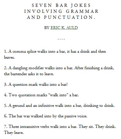
Grammar jokes
I just realized that I don’t have a post ready today, so here’s a quickie that I found on Google+. I hate to not be faithful to the three people who visit the site. Besides I posted a bar joke or two a couple posts back.
Amateurisms
A while back I posted about things professionals generally write that amateurs generally don’t write. Today I turn the tables and point out a few goofs that definitely brand you as an amateur. Most of these are the fault of spoken English. The spoken version of these words is misleading, and if you seldom write, you might write the way these words sound, and get them wrong.
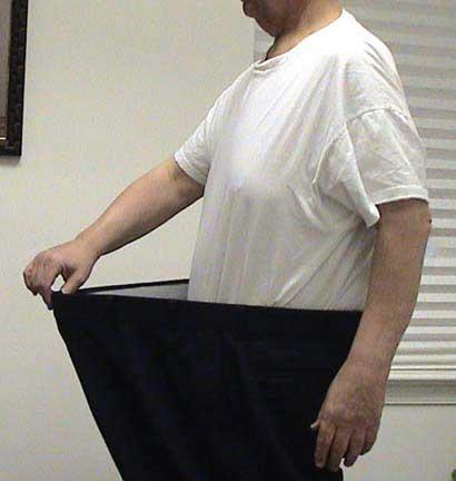
Confusing use and used. When you describe something that was the policy in the past but isn’t any more, we say something like “This is the way we used to do it.” Read that aloud, and you’ll notice that you pronounce used to as useto. In English we find it hard to pronounce a voiced and an unvoiced pair like D and T together. (Try it.) The unvoiced T wins. (Yes, linguists, I know they are called alveolar plosives. They used to be called lingo-dental stop plosives when I was in college.) I recently ran into this in Google+ on a page about weight loss that showed a photo of a svelte guy in some oversized trousers:
Those clothes actually use to fit him perfectly
Oops.
Confusing suppose and supposed. We use this word when we want to say that we expect something to be a certain way. For example, you guys might hear something like
“You are supposed to put the seat down!”
However, when you are guessing (or being polite), then “suppose” is correct.
“Yes, I suppose I should remember to put it down, Dear.”
The reason for this mistake is similar to the reason I mentioned above for use and used. The last sound in “suppose” all by itself is voiced, like a Z. Add an -ed ending, and we can combine the two voiced sounds, ZD. Try it. Now add the unvoiced T. The ZD combo loses out to the unvoiced T sound that follows.
Confusing of and have. I’ll do the example first, which I found on a pretty good techie site in an article about pay-per-click ads.
Thus, if you had 1,000 people clicking on your $55 per-click ad, it would cost you $55,000 dollars and you’d of sold between 20 and 30 products. Google could quite easily deliver the 1,000 visitors to your site in a matter of hours.
(For you math types: How much would that product have to cost for this guy to break even?)
The guilty party here is our tendency to use contractions. In English you can contract a lot of words, including “have” when it’s used with an auxiliary verb. So “could have sold” can be pronounced (and written, but it’s pretty informal) “could’ve sold,” which sounds a lot like “could of.” If you don’t realize what you’re saying, you could get it wrong.
Even if you’re an amateur, don’t make these mistakes.
For the typographers among us
A while back I touched on the subject of page layout. 100% of the people who commented expressed interest in having me go into more detail on the subject. That task has been on a burner ever since, and eventually I’ll be posting a couple posts on the subject.
This post touches on something related to page layout, word layout, or kerning. Kerning refers to setting the space between letters so they look the right distance apart. Back in the days of hand-set type, the letters looked rather like rubber stamps on rectangular blocks of metal (the body of the type). Some letters were so far from rectangular that they looked too far from one or more of their neighbors. So the typographers made the letters extend a bit over the edge of the body. This was called a kern. Two letters that need to be kerned when they are next to each other is called a kerning pair. Look at the A and W in the top example below. The AW pair looks too far apart, even though the bottom of the A and top of the W are exactly lined up.
Many electronic fonts these days come with kerning pairs built in. Kerning is tricky because it is so subjective (it has to “look” right) and the correct kerning varies depending on the font size.
Font management software exists that allows you to fine tune the kerning on your own. Can you see the difference between the middle and bottom examples? Think you might like to try your hand at some manual kerning? Here’s a link to a site that lets you manually set the kerning. The first example shows you the correct location of the letter that needs to move so you can practice using the direction keys. It gives you a score after each word. Beware: they get harder as you go along.


