Lying with Statistics
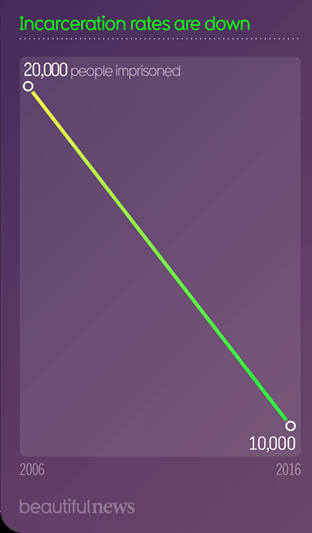
Maybe “lying” is a bit strong here, but it’s a good illustration of how you can tell the truth and still distort things. Here’s the chart:

Beautiful News is a site about graphics; it doesn’t seem to have a political agenda per se, but this is a good example of how not to label a graph.
It makes a reduction by half take up the whole chart! The bottom line should be zero. I think we have a lack of detail here, too. Was the decline in incarcerations really a straight line? What happened in the years before 2006 and after 2016? I think the chart’s purpose is to make a statement, not to give information.
Harrumpf.
PS—I ran into another mis-drawn graph. The left margin of the graph should start where the lines start to go up, and spread out the jagged lines.


Leave a Reply