A New Font!
Google just released a new font, called Noto, and I like it. Not that we don’t already have zillions of fonts, but this one is interesting because of how many languages you can use it in.
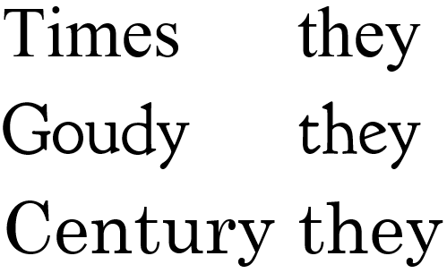
Type yourself some text in your word processor, make it big, say 36 points or even more, and look at what you wrote in something like Goudy. Then switch to Times New Roman, then look at it in Century. The letters are similar but different. Times, for example is narrower (it was designed to use in newspaper columns, which is why a letter-size page is easier to read in a wider font such as Century.)
Now look at what you wrote in something like Fraktur, if you have it.
 German used to use Fraktur all the time. Doesn’t match Century very well, does it?
That’s where Noto comes in. You can use Noto for almost any language you care to write in, and quite a few you are unlikely to use (such as Linear B, for goodness’ sake) and they match! I suppose this is handiest for websites that are likely to be written in more than one language, but I like the idea. A lot.
Here’s a link to an article about it. Go take a look. It’s free; maybe you’d like to download it, too. Oh! Here’s what it looks like:


Leave a Reply