I Can Hardly Believe it—a Comic About Page Layout
More specifically, justification. I haven’t mentioned the comic XKCD in a while. If you’re a geek you probably are familiar with it. Most of the humor involves programming or some other intellectual subject. Randall Munroe has written some fascinating science-related stuff.
T9day’s comic is about approaches people use to keep the right end of lines of text from being too ragged. Justification is when the ends of the lines line up nicely. Nowadays, seeing the left margin justified is pretty much automatic. In fact, the name for letting the right ends of the lines fall where they may is called “rag right,” short for “ragged right.” (This post is rag right.) When both ends of the lines are nice and straight it’s called “full justification,” or merely “justified.” Look at any physical book and it’ll probably be justified.
Why do it one way or the other? Full justification is more formal. It looks nice. Rag right, many say, is easier to read.
The problem with justification happens when you have a narrow column of text. Long words make it harder to average out the spaces between words, and you get noticeable problems. That’s what this comic is about.
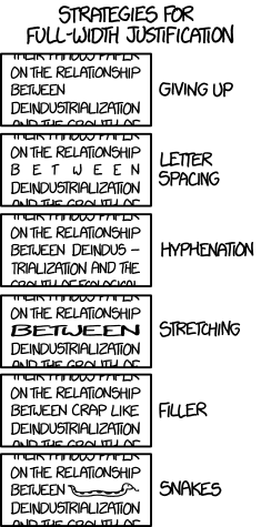
He left out one approach that I find useful, especially now that we have adjustable text boxes—you can move the margin right or left to make the lines a little longer or shorter. Sometimes that solves the whole problem.
That last suggestion, about snakes, used to be used, and still is sometimes in hand-drawn calligraphy. Only it wasn’t normally a snake, but a fancy design called an ornament. I have some text, nicely framed, on my wall that contains this technique.

Leave a Reply