For the typographers among us
A while back I touched on the subject of page layout. 100% of the people who commented expressed interest in having me go into more detail on the subject. That task has been on a burner ever since, and eventually I’ll be posting a couple posts on the subject.
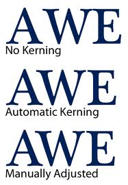
This post touches on something related to page layout, word layout, or kerning. Kerning refers to setting the space between letters so they look the right distance apart. Back in the days of hand-set type, the letters looked rather like rubber stamps on rectangular blocks of metal (the body of the type). Some letters were so far from rectangular that they looked too far from one or more of their neighbors. So the typographers made the letters extend a bit over the edge of the body. This was called a kern. Two letters that need to be kerned when they are next to each other is called a kerning pair. Look at the A and W in the top example below. The AW pair looks too far apart, even though the bottom of the A and top of the W are exactly lined up.
Many electronic fonts these days come with kerning pairs built in. Kerning is tricky because it is so subjective (it has to “look” right) and the correct kerning varies depending on the font size.
Font management software exists that allows you to fine tune the kerning on your own. Can you see the difference between the middle and bottom examples? Think you might like to try your hand at some manual kerning? Here’s a link to a site that lets you manually set the kerning. The first example shows you the correct location of the letter that needs to move so you can practice using the direction keys. It gives you a score after each word. Beware: they get harder as you go along.


Leave a Reply